Tokyo Game Show 2005… Get The Fuck Over It!
Editorial by Ravi Singh, Posted on October 05, 2007
Let me take you back to 2005, because it really has been that long. The Xbox 360 has not been released yet, Metal Gear Acid² was just about to be released in Japan, and the Wii was still the Nintendo Revolution (or REBAROOSHUN if you're Japanese).
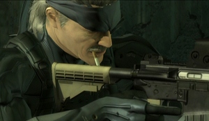 Oh shit, is this Big Boss in 4D HIGH-DEF ULTRA REALISM?!
There was also a trailer for Metal Gear Solid 4: Guns of the Patriots. This wasn't the first trailer for the game, but it was the first one that actually had anything to do with the game–it was the first time people saw Old Snake, Metal Gear Mk.II (at least outside of Snatcher), mooing Metal Gears, the Solid Eye (which was obviously not an eyepatch, but people are idiots), and sad Arabic-ish music.
It looked great. With the way that everything moved so smoothly, how the environment actually changed, and the fact that it was all done in real-time, it's no surprise that the trailer was basically used as a propaganda trailer to hype up the PlayStation 3 and it's CELL processor by not only having a PlayStation 3 logo shine up at the start of the trailer, but also the fact that Otacon makes CELL sound like the cure to global warming. God damn though: not only will it be around a year until the PlayStation 3 comes out, but who fucking knows when the game itself will finally be released. Especially if you live in Europe. Still, as Otacon said "It'll be worth it!"
Two years later, a number of fans don't think it will be worth it anymore–they are pissed off because apparently the graphics for Guns of the Patriots went from swank to failure. For some odd reason, these people have gotten an erectile dysfunction disorder that relates to their disappointment in Metal, Gears (but not the ones that are of war), and Solids because apparently this game now looks like shit, which…
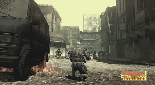
…is not true at all. However, let's get rational. It does looks kind of different from what we've seen back in 2005, and Kojima Productions said that the final product would look a lot better than what we saw then. So what gives? Is everyone who's fine with the graphics blind?
There's the claim that Metal Gear Solid 4: Guns of the Patriots looks different now because Kojima Productions want to make sure that the game will be ported flawlessly to the Xbox 360. This claim is mostly made by Sony fanboys who think that a possible port is a big deal, so they want to put any blame they can on Microsoft. However, this is not the case at all:
Aside from the idiotic Microsoft conspiracy that I needed to make clear, there's the fact that the trailer shown at Tokyo Game Show 2005 was made from a devkit before the final PlayStation 3 specifications were finished. So while the trailer was indeed in real-time, it was not literally on actual PlayStation 3 hardware. Sony changed the hardware profile a good number of times before they revealed the final configuration, so who knows what went in, out, back in, and out just in time? Besides that, the trailer was an experiment anyways–Kojima Productions had yet to really work on the gameplay and… anything at all in regards to the game. After TGS 2005, they just began working on the "XXXX" gameplay system. Odd that we never hear about this "XXXX" after Kojima blogs about it, huh? Could it be that another hardware change fucked their plans?
Then in January 2007, Kojima stated that he's not very fond of high-definition for video games:
The TGS 2005 trailer was 720p at most. While Kojima and his team aren't fond of high-definition, it's highly likely that Guns of the patriots will be in 1080p or 1080i due to it being the PlayStation 3's showcase game, and what better way to brag about graphics than to have them run in 1080p? The issue here is that Metal Gear Solid 4 and it's cutscenes are done in real-time. A 1080p picture done in real-time with a good framerate requires a bit of processing power… some of which would have been used for the shadowing and whatever… if resources were available, right? Maybe certain features were sacrificed for HD? I mean, this is the first PlayStation 3 title Kojima Productions is working on so they don't know the limits yet. This is similar to how Metal Gear Solid 2: Sons of Liberty looked great, but Metal Gear Solid 3: Snake Eater looked 1,923,218 times more better because they had more experience with the PlayStation 2 hardware three years after finishing Sons of Liberty. In addition, if Kojima just started discussing high-definition in early 2007, then obviously they didn't work on the rather large and detailed textures and character models needed for the HD picture until… who knows?
In the end, it all leads up to people like me actually having our eyes open, and people with ED syndrome due to the change in graphics are dealing with eyesight problems now. In other words, you're being fooled. I have taken screen captures of the Tokyo Game Show 2005 trailer (left) and comparable ones from the in-game cutscene from the gameplay demonstration shown at the Metal Gear 20th Anniversary party (right):
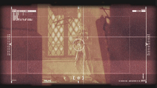
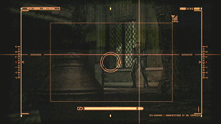
This is the first-person view from Otacon's Metal Gear Mk.II. Nothing major here for anybody to bitch about, but the 2007 screenshot looks a lot more detailed and the environment looks more round and less… polygonal.
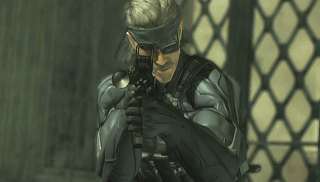
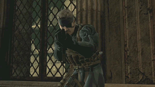
Snake notices that he's being watched. From here, the 2007 one still looks a bit better. Just look at the textures being used for the walls. The 2005 one used a lot of depth of field work to focus on Snake and blur the fuck out of everything else. Also, Snake looks really weird in the 2005 one. He just… doesn't look like Snake. I mean, fuck, look at those ears!
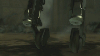
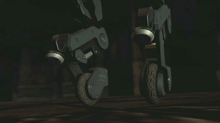
The Mk.II's wheels look similar, but the 2007 one actually has more detail in the textures. Look at the actual tracks on the wheels. There is smoke in the background of the 2005 trailer, but that's from a random explosion that occurs before this scene, which does not happen in the 2007 version; although random explosions happen all the time in-game as shown by the same trailer, so who fucking cares?
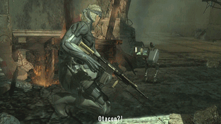
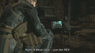
Things start looking different here. While Snake's OctaCamo looks shiny in the 2005 trailer, it looks more detailed and real in the 2007 trailer. A lesson to game developers: NOT EVERYTHING IN REAL LIFE IS FUCKING SHINY! Do you know how weird it is to see Sonic The Hedgehog look like he's wrapped in saran wrap? Thank god Kojima Productions decided to take the plastic wrap off of Snake. Here's another angle of the same shot:
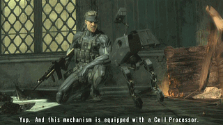
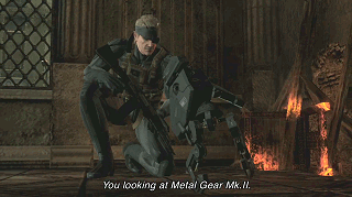
Nevermind the "YOU LOOKING AT" translation error nonsense: like I said before, the walls look better now than before. Another thing I must point out is the fact that Snake's pose in the 2005 trailer is rather awkward. In the 2007 one, he's still got a good grip on his gun, should any enemy walk in to ruin this meeting. Although the Mk.II looks almost identical, it looks sharper in the 2007 version. The fire that's around Snake's left looks more real in the 2005 shot though, which could be due to the way the lighting was handled back then. Another example of this is the lack of light from the window in the 2007 shot, which is kind of a downer considering how intense the sun is in the middle east. I wouldn't know, but I'd put money on it being pretty fucking shitty during the day.
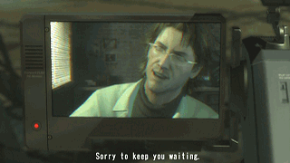
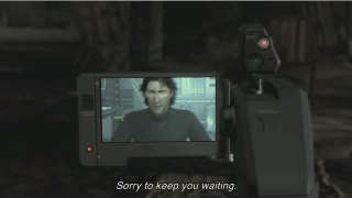
Then there's Otacon himself. Both versions feature a fully polygonal Otacon with a filter over the real-time feed to make it look like an LCD screen. Admittedly, Otacon and his surroundings are a lot more detailed in the 2005 version and the lighting from the blinds adds to this. Still, it's fucking Otacon. At least it's not a bobbing head.
All in all, the major differences in graphics between what we saw in 2005 and what we have seen recently are the lighting, Otacon, and Snake himself. The lighting definitely looks completely different now than it did back then, and could be the only thing that actually doesn't look as good now. Otacon looks less detailed now, but realistically, he wouldn't look amazing on a tiny LCD screen attached to a life-sized Mk.II now, would he? As for Snake… we'll get back to him later.
Now the screenshots above don't reveal a dramatic difference aside from the lighting (the only thing that the TGS 2005 trailer does better), character models, and textures, right? How can this be when enough people bitch about some insane change in the graphics department to warrant me actually typing this shit out? It's because I increased the brightness of the shots I've taken of the Tokyo Game Show 2005 trailer above.

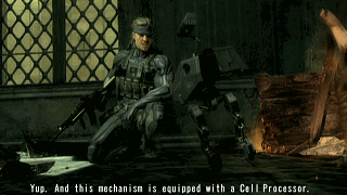
The one to the right is how the actual trailer looks like before I adjusted the brightness to fuck with everyone. The ridiculous amounts of shading makes the overall image seem highly impressive because it's making the bright parts stand out (the lighting) while covering up the lack of detail (which Guns of the Patriots currently has, as shown by the 2007 trailers). It's no different than what girls with bad acne do on MySpace.

High-contrast – better than a badger to the face!
I didn't brighten up my shots from the 2007 gameplay demonstration video because despite the fact that Snake is in a dark room, you can still see the amazing detail, which the TGS 2005 trailer lacks. Don't believe me? Let's take a closer look at Snake from 2005 and 2007:
Tokyo Game Show 2005
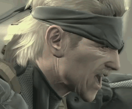
E3 2007
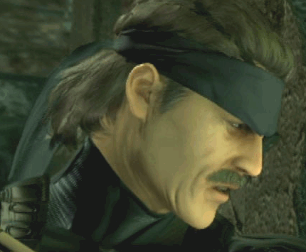
The amount of detail given to Snake now is a hell of a lot more than was before. Fuck, Snake actually looks like Snake now (it's the nose and the eyes), whereas before he somewhat resembled an old guy who wanted to be him. Snake also looks a lot older, sports a messy bandanna, and has free flowing hair. Also, check out the detail on the collar of the OctaCamo and how that ear looks like you can take a cotton swab and clean the ridges on it! There is a lot of detail given to the polygonal models now than there used to be.
Guns of the Patriots doesn't look worse than what was shown to us back in 2005–it just looks different. Sure, the lighting isn't as impressive as it was shown to be in 2005, but everything else seems more detailed now. Besides, it's been two fucking years and this is Kojima Production's first actual next-gen game, let-alone their first PlayStation 3 game, so give them a break. This is not "proof" that the game will be ported to Xbox 360 because even if there was one, the game is being developed for the PlayStation 3 hardware despite your fanboy-inspired fears. Just get the fuck over it already, and appreciate the beauty that this game is, graphically speaking.